01 / 06 — Overview
Apotik
Science, intuition, and aesthetics — a visual identity reflecting the balance between reason and sensitivity
Client
Jazmin (pharmacist)
Year
2025
Duration
2 months
Type
Branding
02 / 06 — Context
Apotik is an aesthetic health brand founded by Jazmin, a pharmacist who believes that true well-being comes from the balance between reason and sensitivity. More than a clinic, Apotik is a space for reconnection — where science and nature converse, and every detail is designed to inspire comfort, beauty, and trust.
03 / 06 — Challenge
Design a brand that seamlessly blends scientific precision and human sensitivity — creating a visual identity that communicates both trust and emotion.
04 / 06 — Research
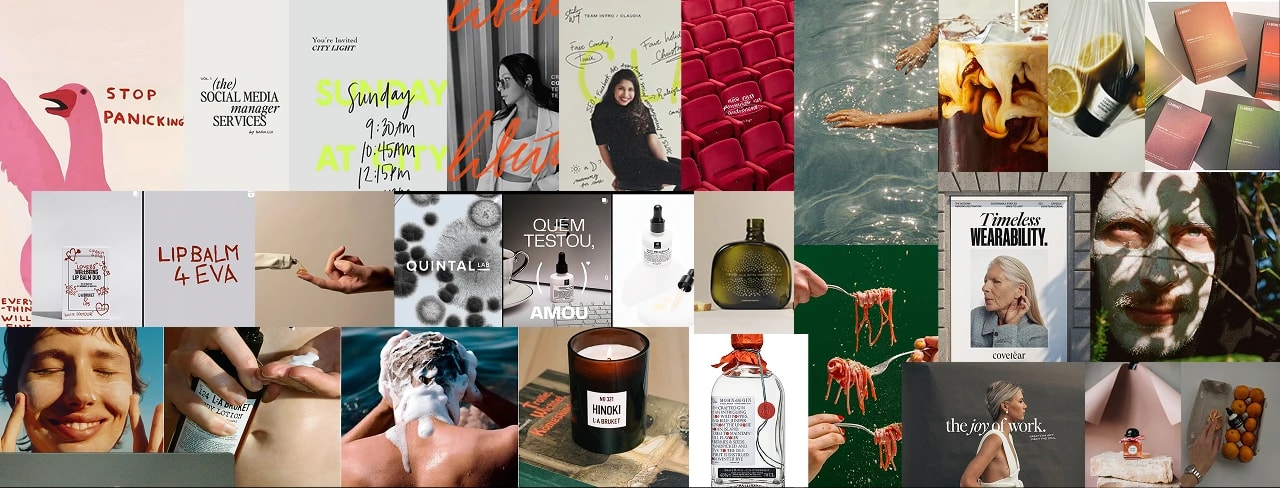
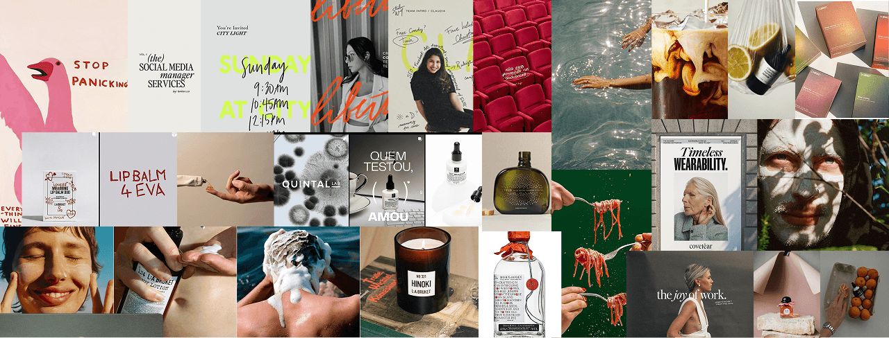
The research phase focused on understanding Jazmin's essence and how Apotik stands out in the aesthetics field. Interviews, tone-of-voice analysis, and visual benchmarks were conducted to map perceptions of trust, beauty, and authenticity.
05 / 06 — Solution
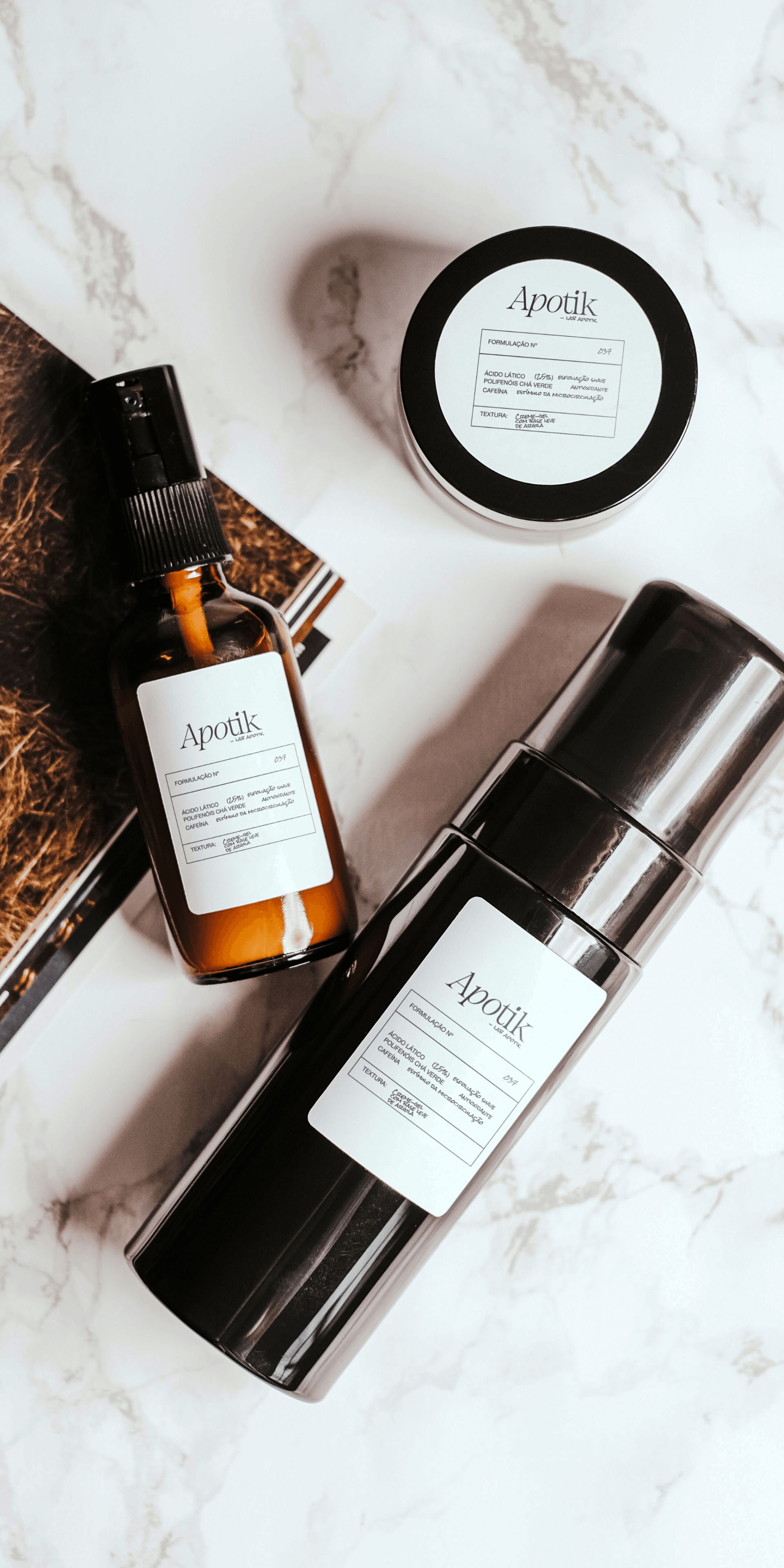
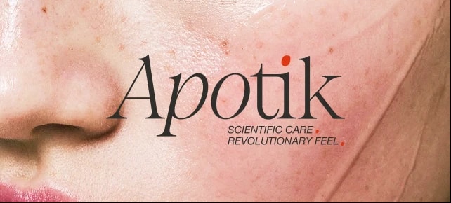
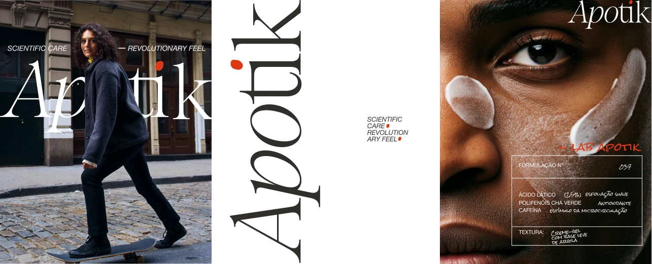
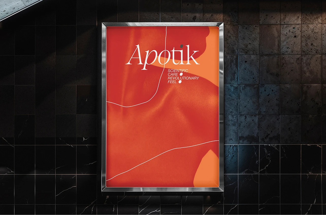
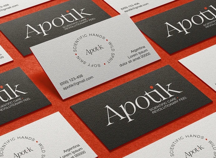
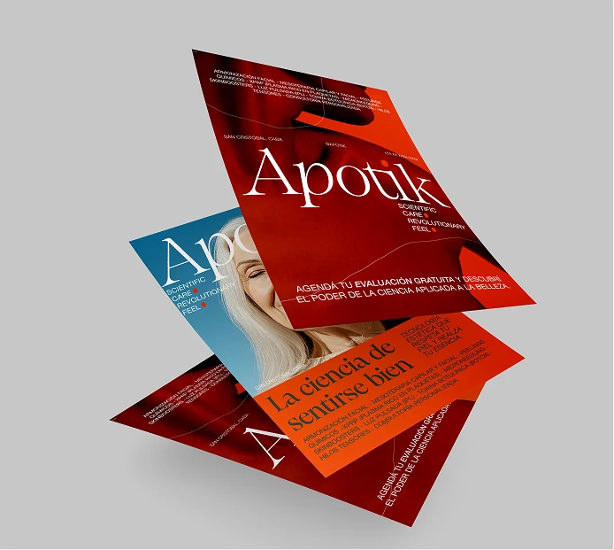
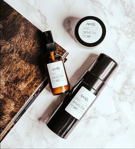
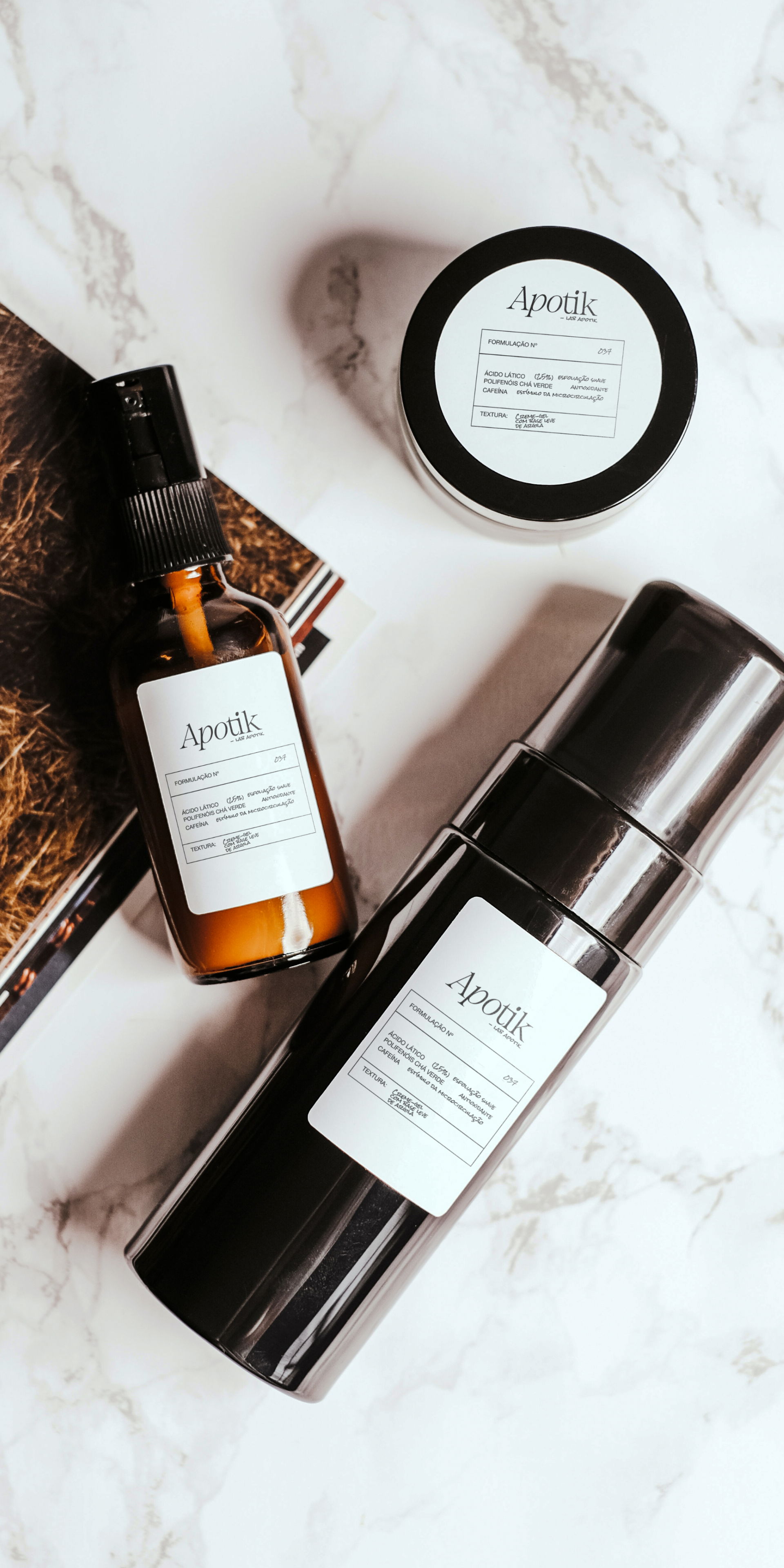
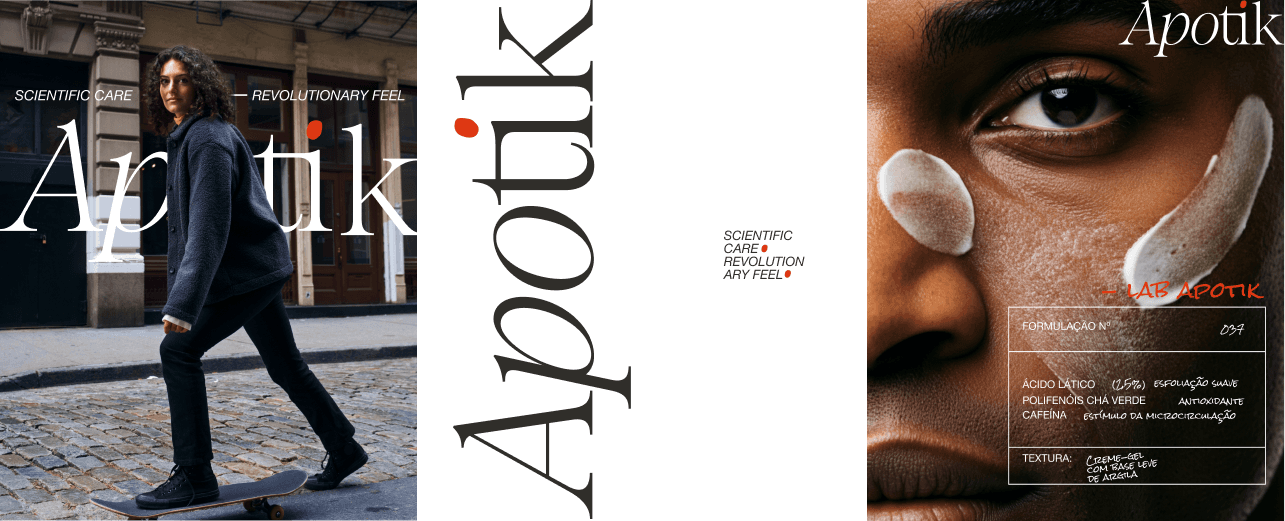
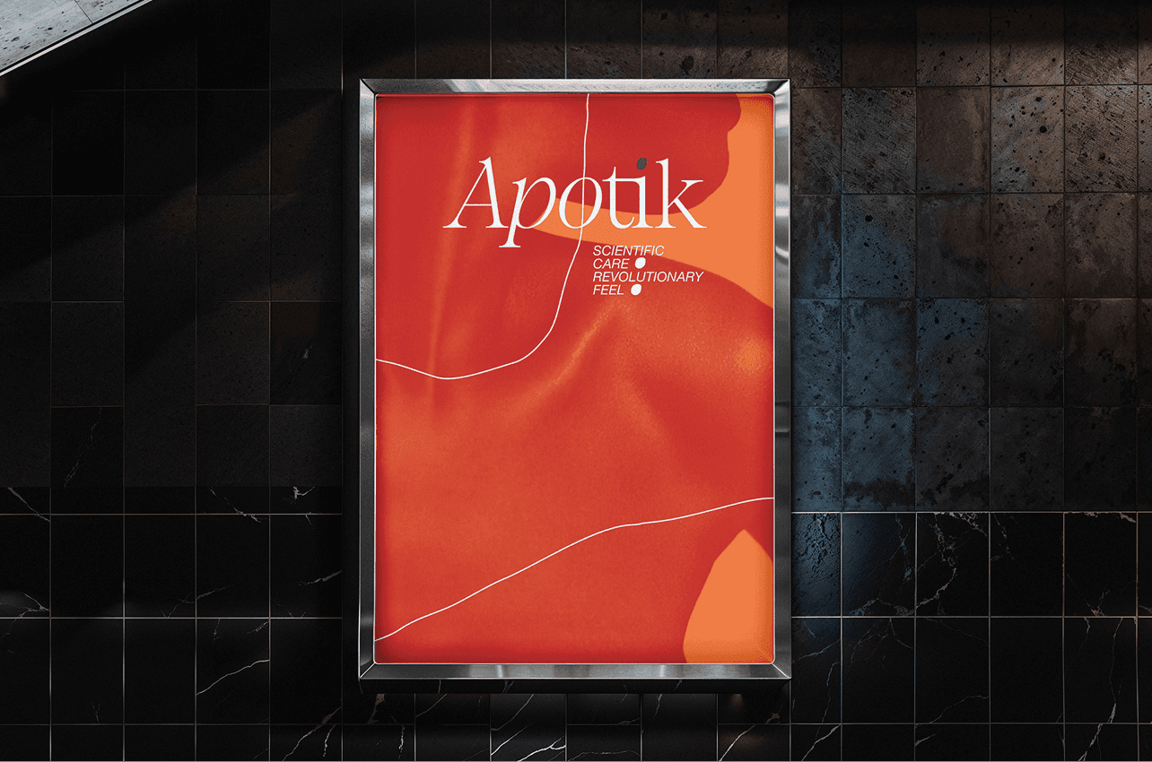
We created a visual system that balances care with clarity. The lowercase logo, soft yet structured, sets the tone for a brand rooted in trust and intention. With a neutral palette, spacious layout, and natural textures, the design invites calm and confidence.
06 / 06 — Results
Apotik's identity emerges from the union between the rational and the intuitive. The lowercase logo, with its subtle lines, reflects closeness and care. The neutral palette and natural materials reinforce the brand's clean, contemporary aesthetic.
01 / 06 — Overview
Apotik
Science, intuition, and aesthetics — a visual identity reflecting the balance between reason and sensitivity
Client
Jazmin (pharmacist)
Year
2025
Duration
2 months
Type
Branding
02 / 06 — Context
Apotik is an aesthetic health brand founded by Jazmin, a pharmacist who believes that true well-being comes from the balance between reason and sensitivity. More than a clinic, Apotik is a space for reconnection — where science and nature converse, and every detail is designed to inspire comfort, beauty, and trust.
03 / 06 — Challenge
Design a brand that seamlessly blends scientific precision and human sensitivity — creating a visual identity that communicates both trust and emotion.
04 / 06 — Research
The research phase focused on understanding Jazmin's essence and how Apotik stands out in the aesthetics field. Interviews, tone-of-voice analysis, and visual benchmarks were conducted to map perceptions of trust, beauty, and authenticity.
05 / 06 — Solution
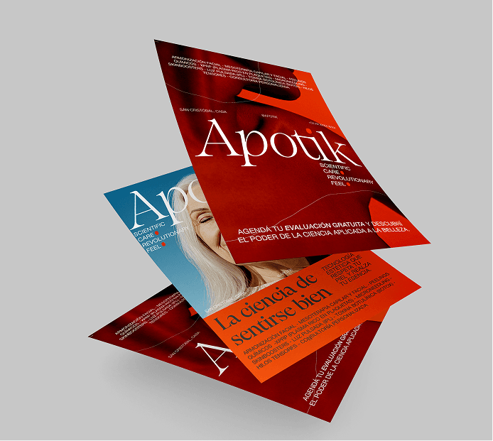
We created a visual system that balances care with clarity. The lowercase logo, soft yet structured, sets the tone for a brand rooted in trust and intention. With a neutral palette, spacious layout, and natural textures, the design invites calm and confidence.
06 / 06 — Results
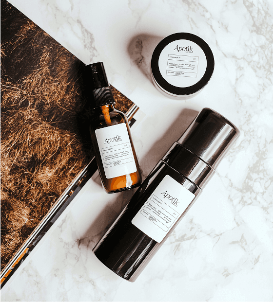
Apotik's identity emerges from the union between the rational and the intuitive. The lowercase logo, with its subtle lines, reflects closeness and care. The neutral palette and natural materials reinforce the brand's clean, contemporary aesthetic.