01 / 06 — Overview
Fresta
A visual identity rooted in presence and meaning
Client
Bruna
Year
2026
Duration
1 month
Type
Branding
02 / 06 — Context
This project focuses on the development of a personal visual identity connected to a specific field of practice: graphic and editorial design guided by research, culture, and critical thinking. The identity needed to assert autonomy and professional clarity without overlapping with the studio's institutional visual language.
03 / 06 — Challenge
Balance proximity and autonomy. The identity needed to operate within an already established cultural repertoire without visually reproducing it, and without relying on generic or overly expressive graphic solutions.
04 / 06 — Research
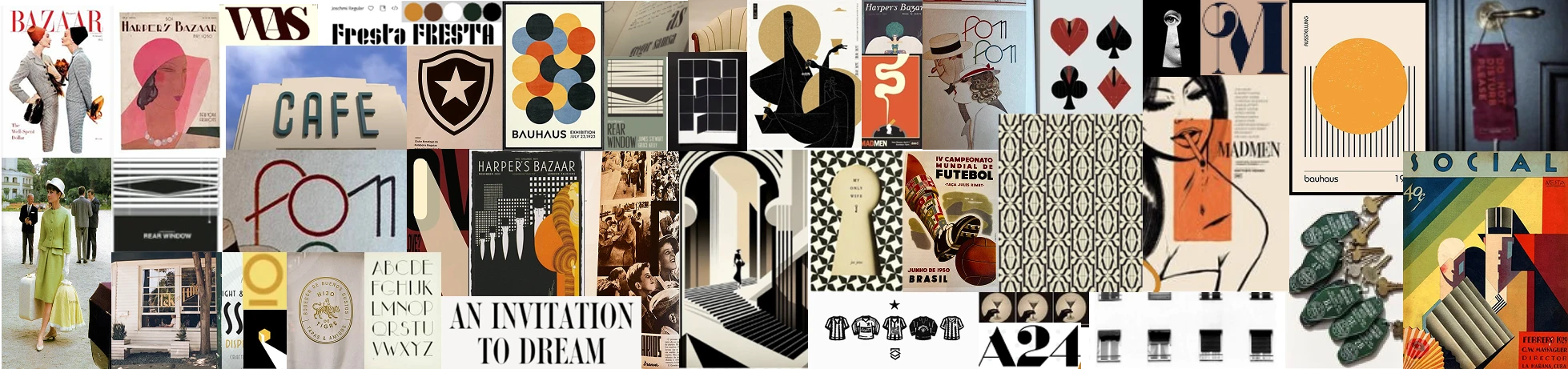
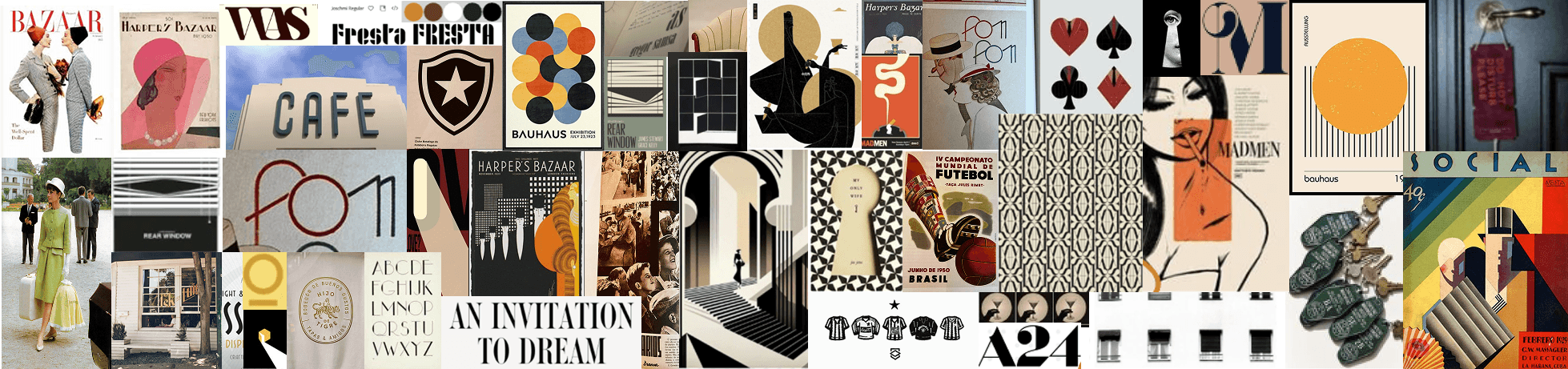
The research phase centered on contextual and field analysis rather than formal references. It examined the professional environments in which the identity would operate, the types of content produced, and the symbolic relationship with Fresta.
05 / 06 — Solution
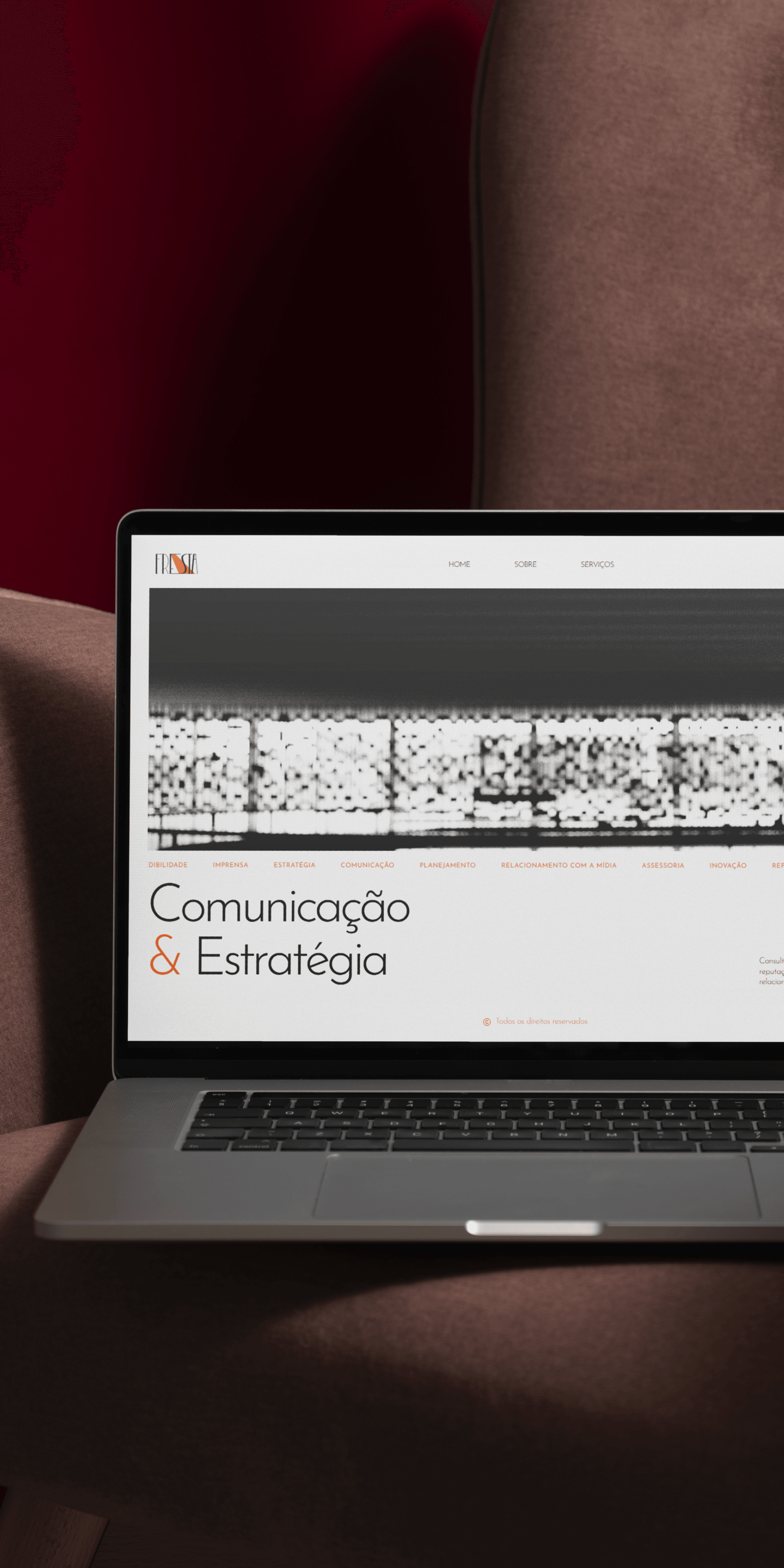
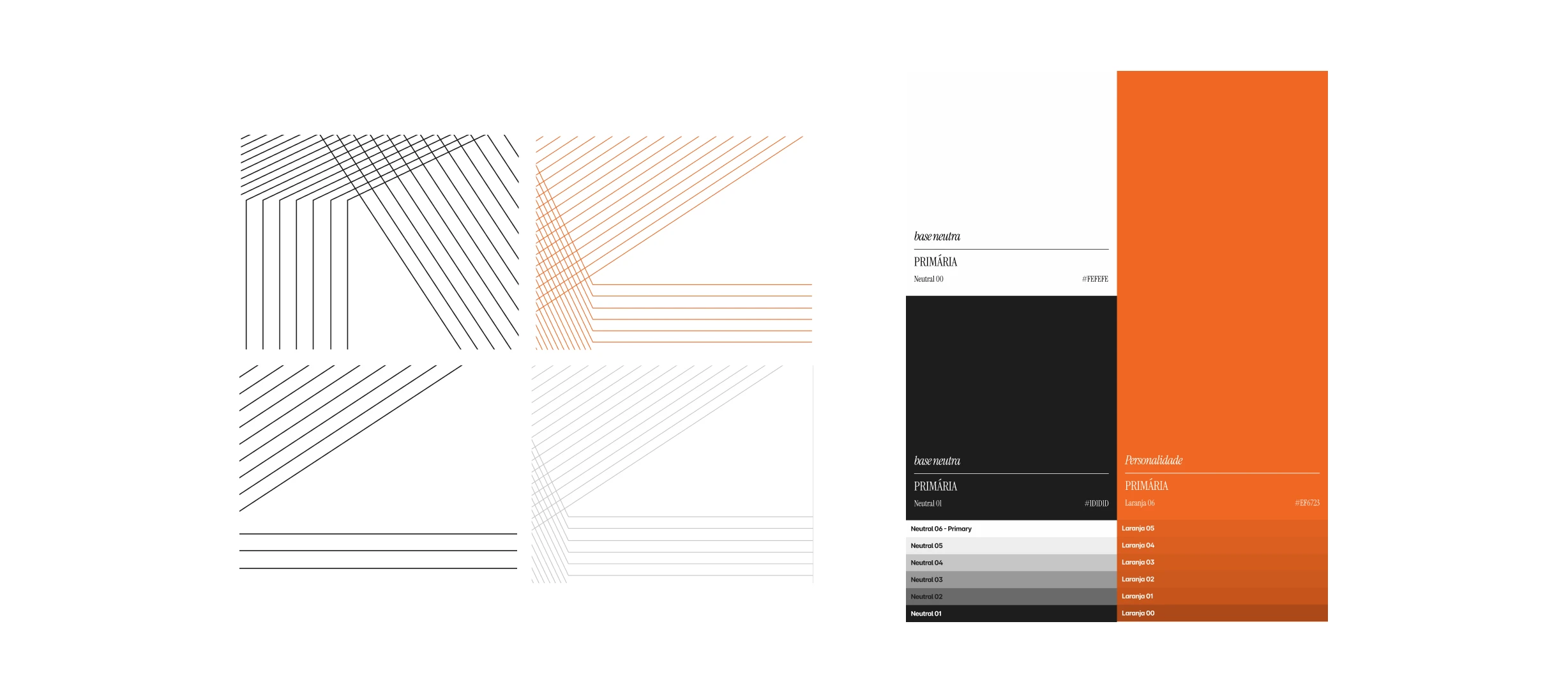
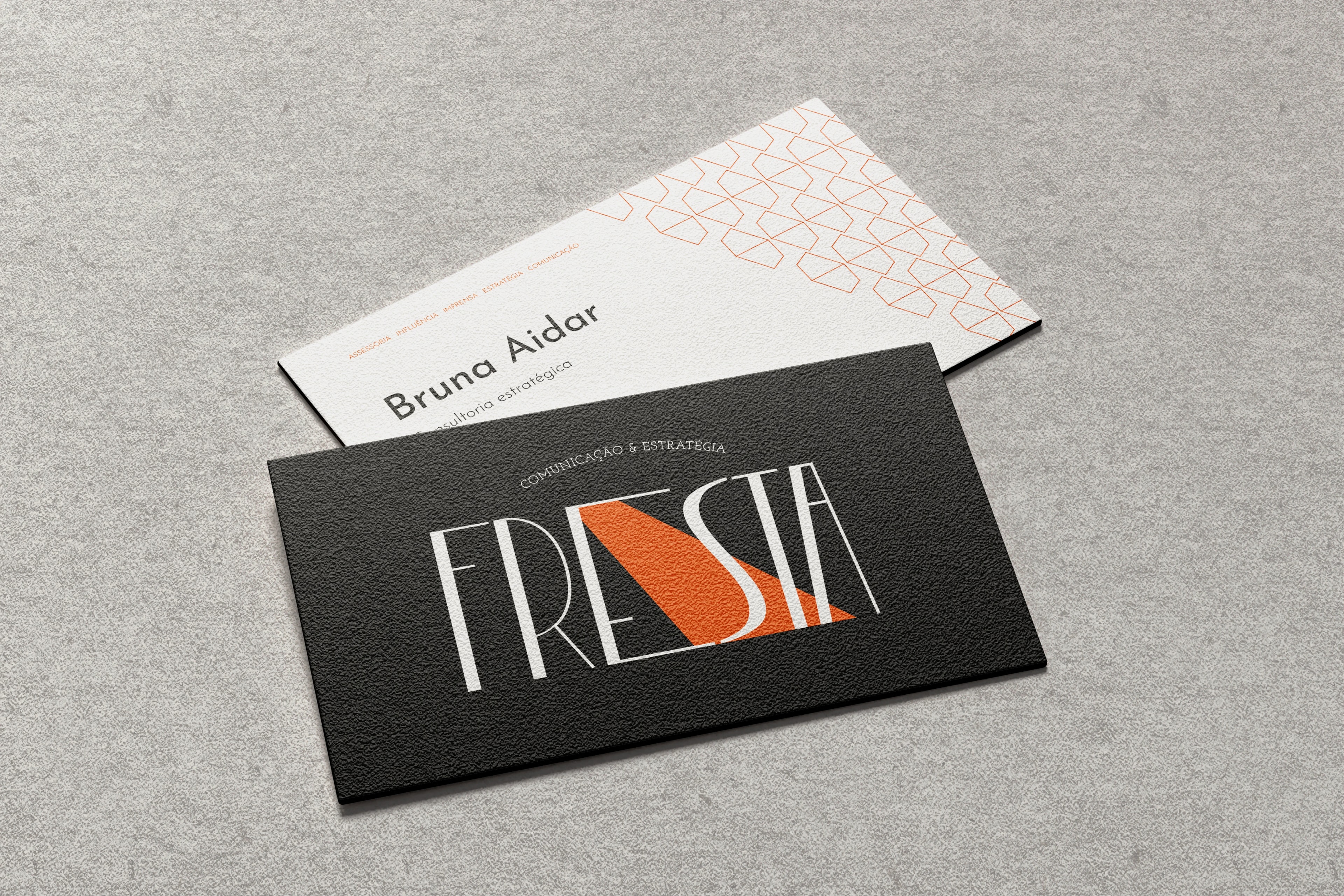
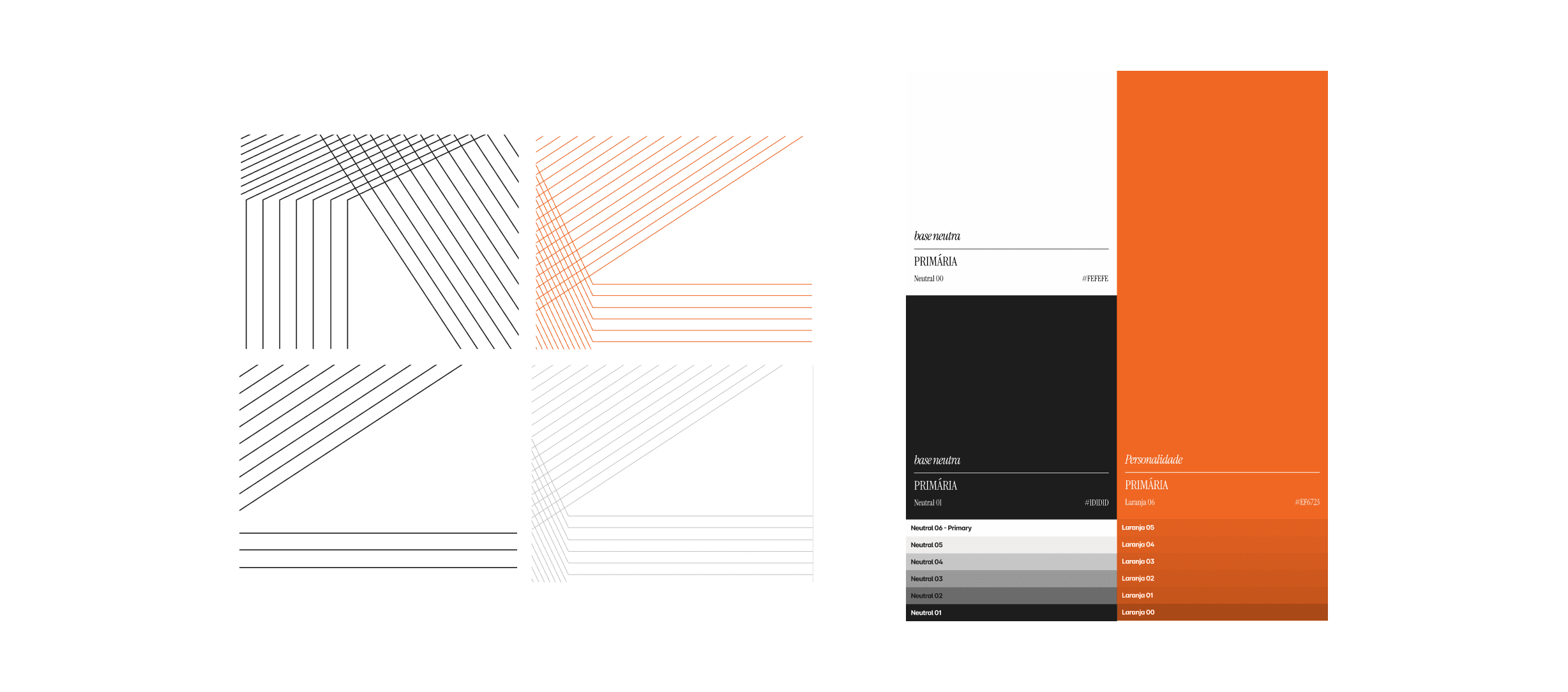
The solution was based on a fundamental strategic decision: not to visually translate Fresta, but to share its structural principles. The identity was conceived as a rational graphic system, where typography, composition, and space function as tools for organizing thought.
06 / 06 — Results
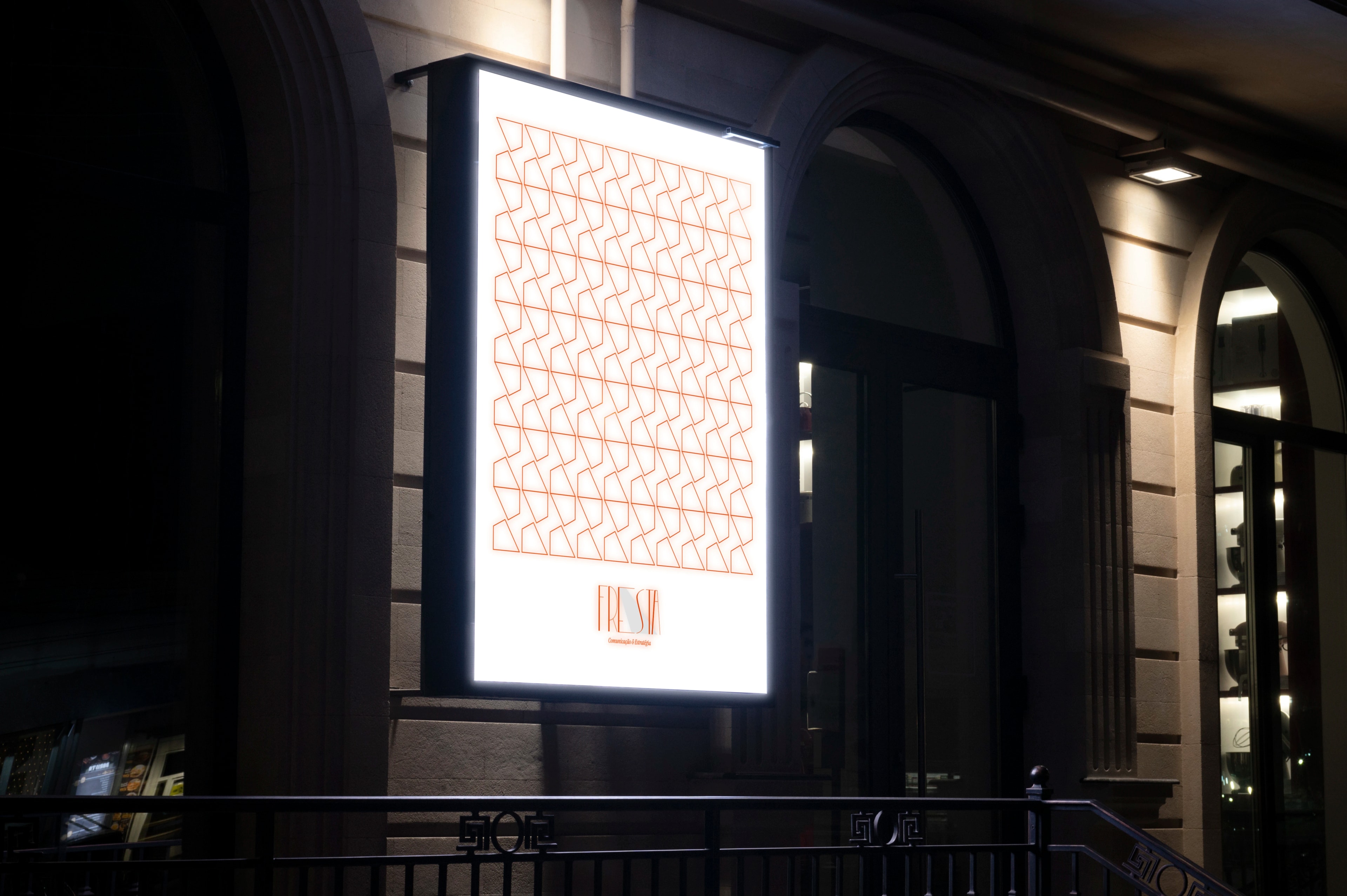
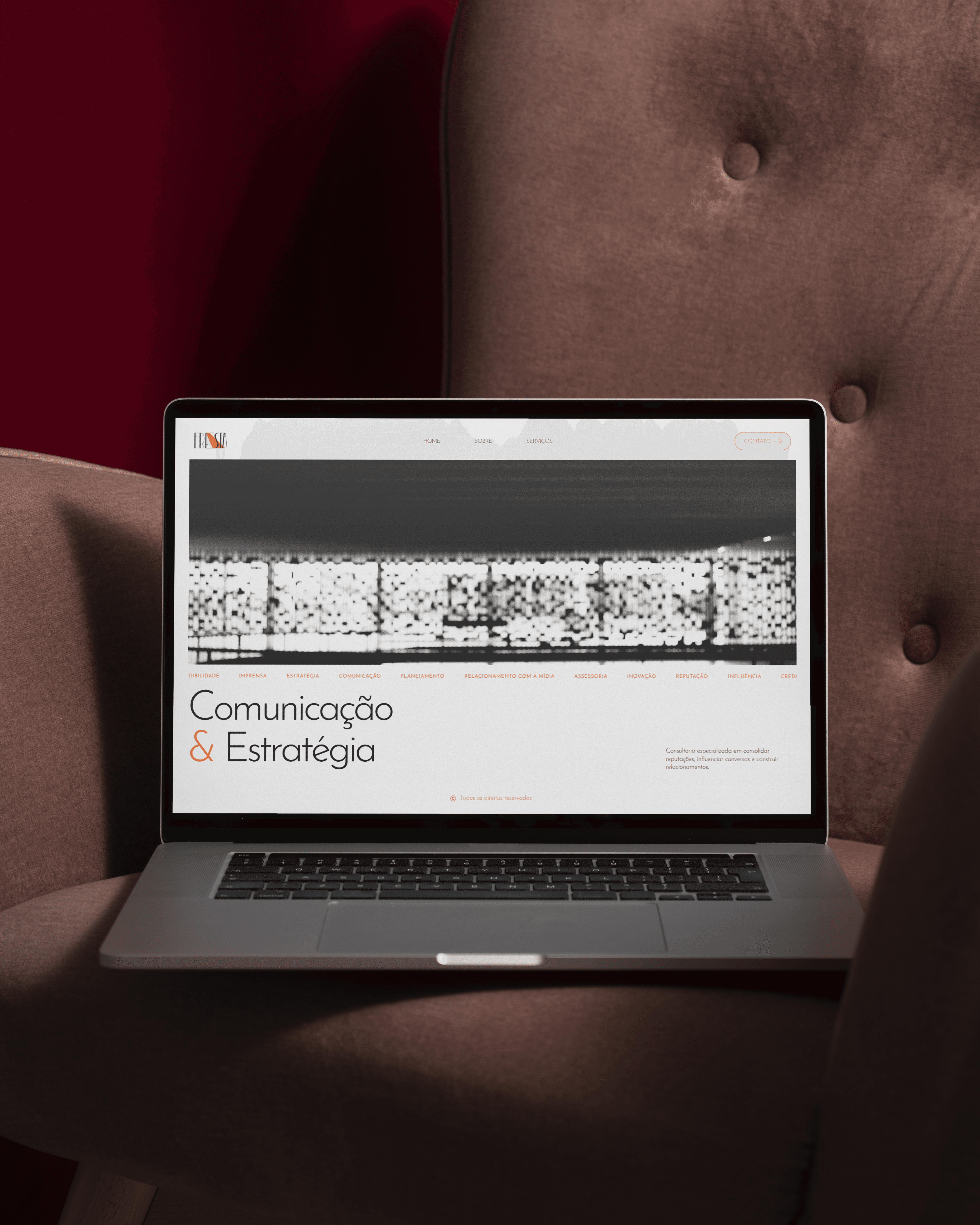
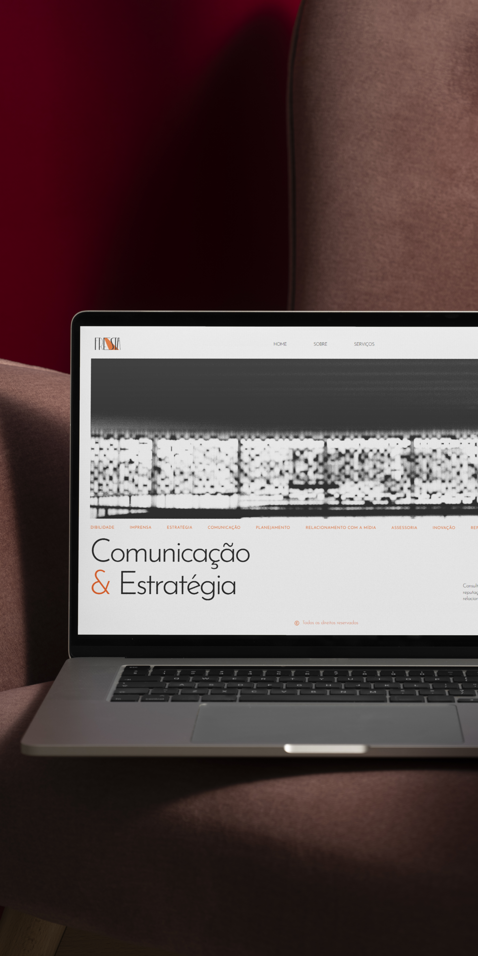
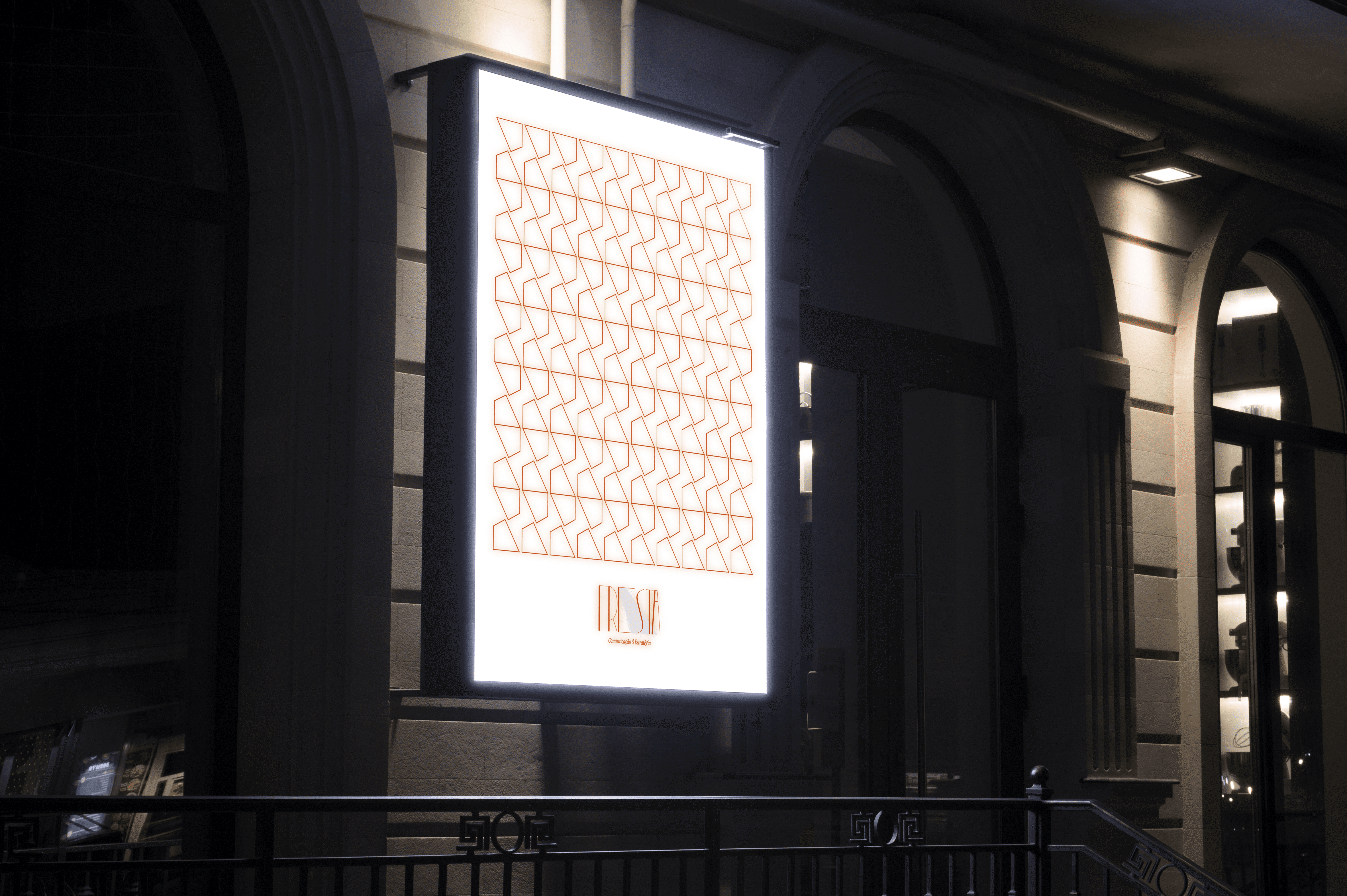
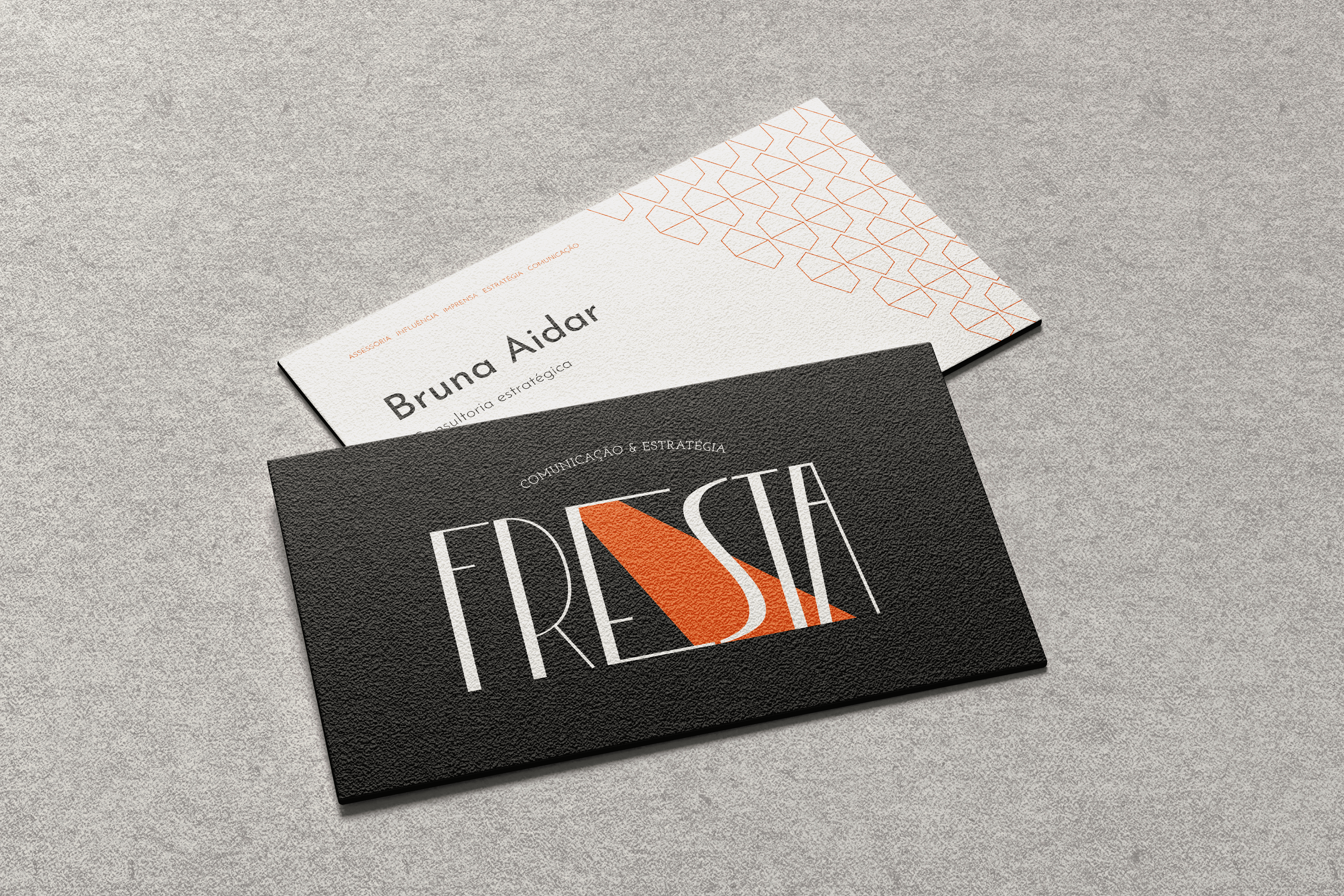
A consistent, functional, and long-lasting visual identity, capable of adapting to different contexts — portfolios, texts, presentations, editorial materials — without losing conceptual coherence.
01 / 06 — Overview
Fresta
A visual identity rooted in presence and meaning
Client
Bruna
Year
2026
Duration
1 month
Type
Branding
02 / 06 — Context
This project focuses on the development of a personal visual identity connected to a specific field of practice: graphic and editorial design guided by research, culture, and critical thinking. The identity needed to assert autonomy and professional clarity without overlapping with the studio's institutional visual language.
03 / 06 — Challenge
Balance proximity and autonomy. The identity needed to operate within an already established cultural repertoire without visually reproducing it, and without relying on generic or overly expressive graphic solutions.
04 / 06 — Research
The research phase centered on contextual and field analysis rather than formal references. It examined the professional environments in which the identity would operate, the types of content produced, and the symbolic relationship with Fresta.

05 / 06 — Solution
The solution was based on a fundamental strategic decision: not to visually translate Fresta, but to share its structural principles. The identity was conceived as a rational graphic system, where typography, composition, and space function as tools for organizing thought.
06 / 06 — Results
A consistent, functional, and long-lasting visual identity, capable of adapting to different contexts — portfolios, texts, presentations, editorial materials — without losing conceptual coherence.